Living Inside a Broken Clock: Monday, Jan. 4, 2010
Living Inside a Broken Clock: Monday, Jan. 4, 2010
by gmak
This is your market.
This is your markert on drugs.
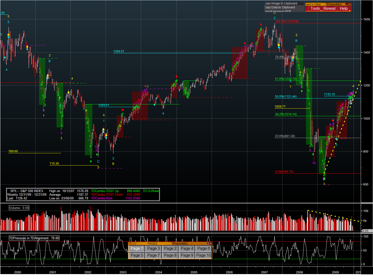
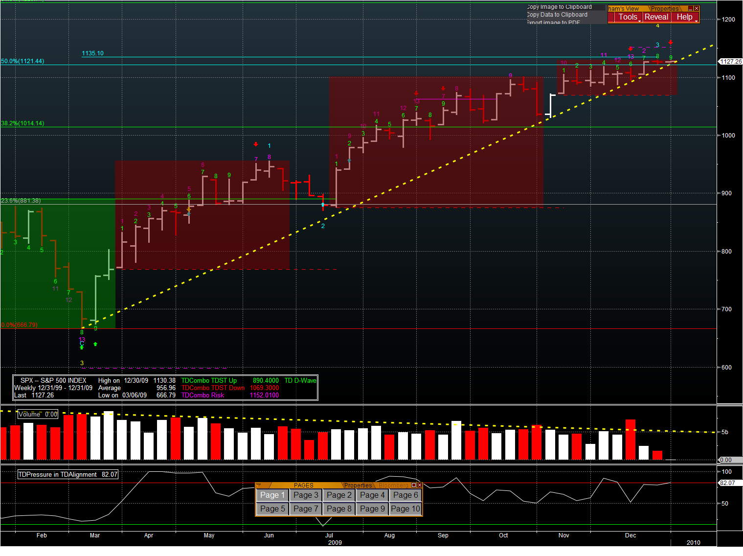
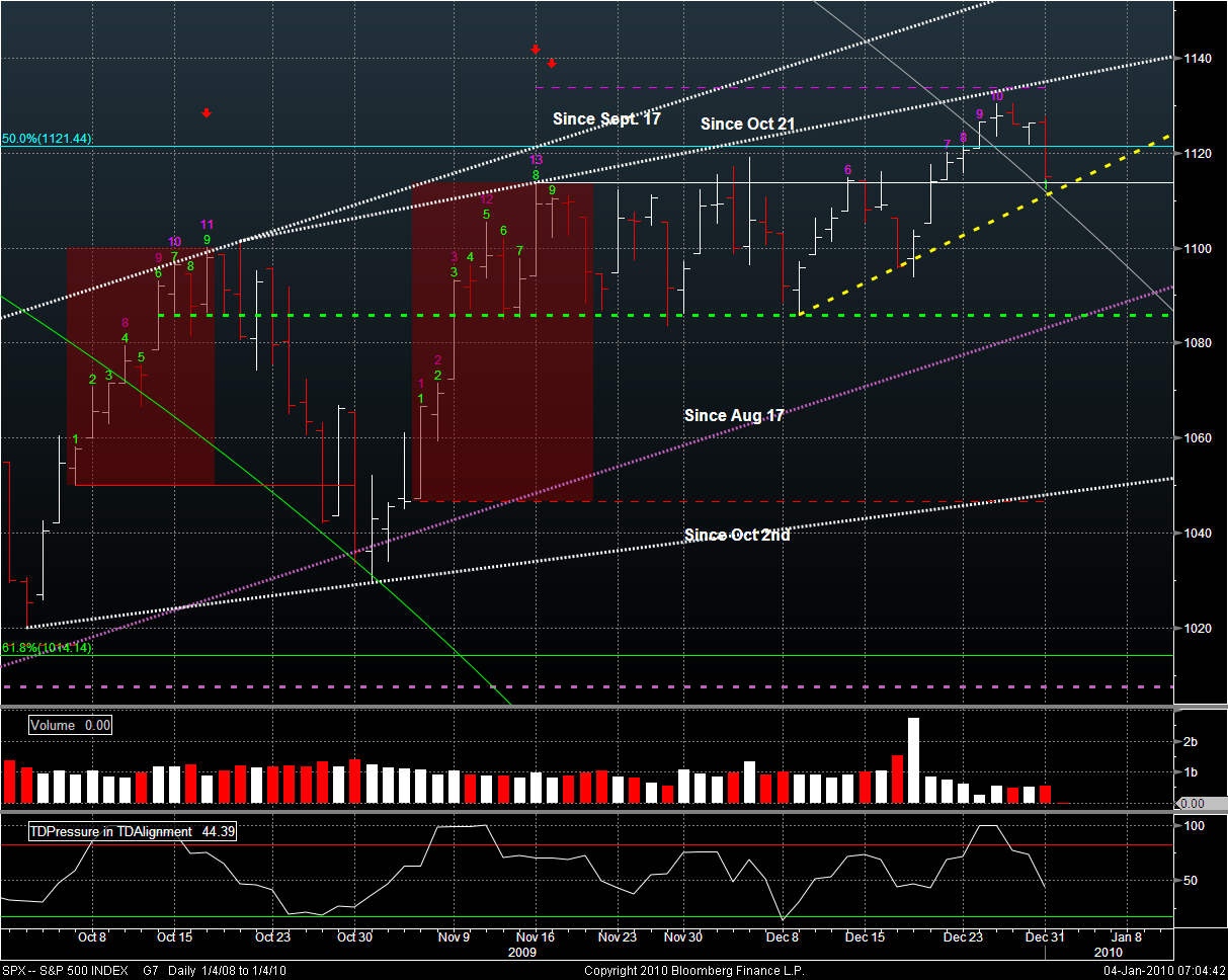
The weekly SPX is slightly ahead of the TD time frame of the weekly ES, which was posted last week. Bar 9 of 9 in a Sell setup up is complete. The high of bar 8 or 9 is higher than the high of bar 6 and 7 – which means this setup has been perfected (in TD parlance) and should see a 1 to 4 bar sell-off. Supporting this is the TD Pressure at the bottom of the chart which shows a disconnect from SPX (a lower high when SPX is showing a higher high). As well, SPX is tracking the yellow dashed trend line quite closely, but looks like it is being forced into the nose of the wedge with the top being a slightly offset echo of the 50% FIB.
My opinion is that the beginning of January will see selling into strength. I’m not sure of the extent, since it is supposed to come from those who want to lock in gains but not pay any taxes until next year. There are many more ways to do this besides selling – especially with the VIX so low. But this jibes nicely with the weekly TA for the SPX above which suggests there will be a reflex retrace of SPX.
If you’re a bear, pray to the deity or planetary orb of your choice that the yellow trend line gets broken early in the year (replete with retrace back to the line) so that we can get the madness over with quickly. If not, wait for the money to run out in the second quarter – assuming that no more desperate measures are forthcoming. Although, I wouldn’t count on that. (Where do you find these people?).
http://www.bloomberg.com/apps/news?pid=20601039&sid=a48c8UpUMxKQ
THE LONG HAUL
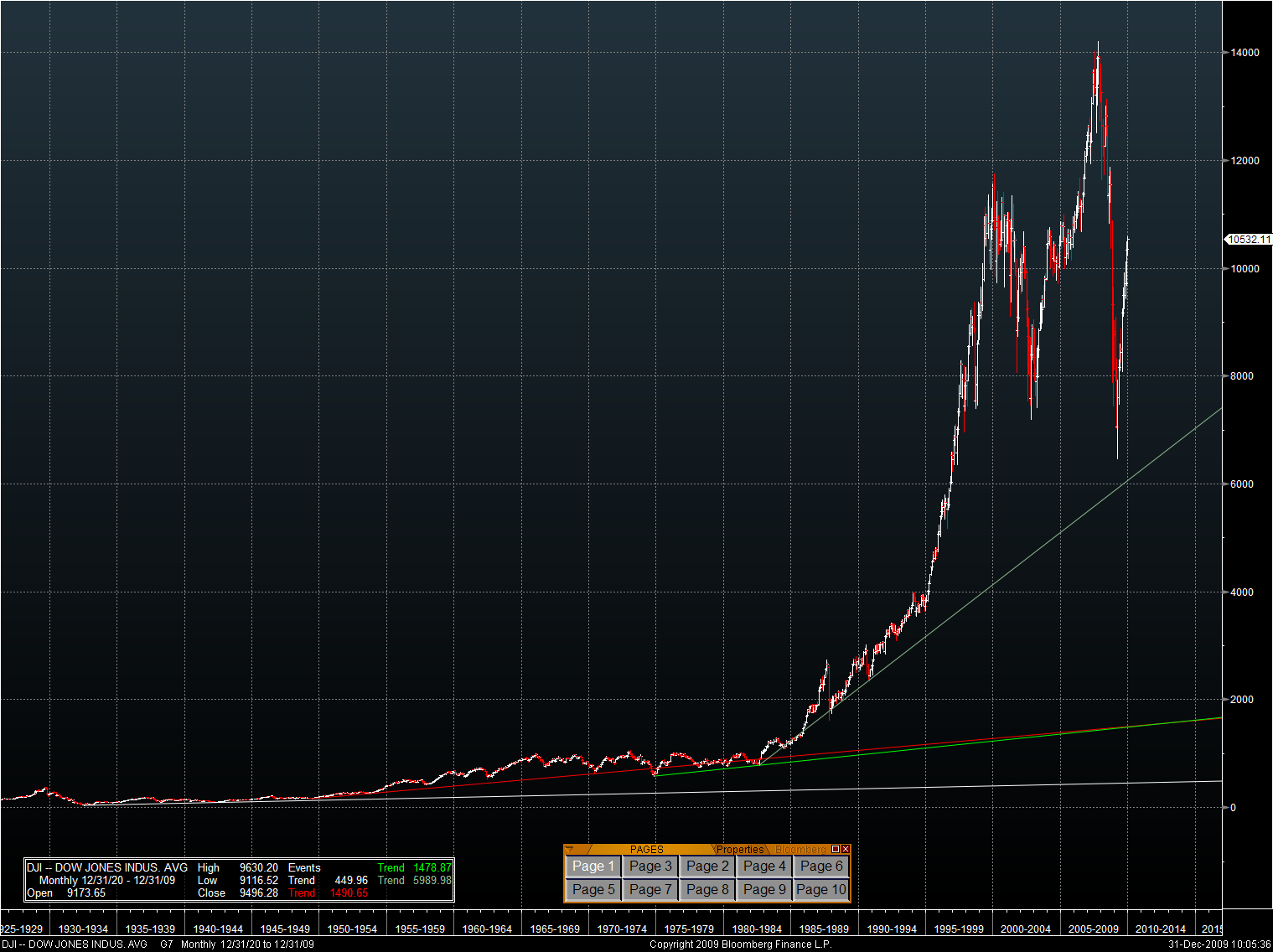
Let’s step back and look at the long run performance of the Dow. The following charts are monthly forever charts. I think that most would agree that, over the long run, that the dividends paid by the stock market should more or less grow at the rate of GDP growth. The white trend line at the bottom shows the market trend from the bottom in the’thirties’ on. The red line shows how this picked up after the 2nd world war. The green line is just another version of this off of different points. Olive shows what happened to the market when Greenspan turned on the taps after the ’81 recession. You can see for yourself what happened from ’95 on when Greenspan couldn’t resist opening the flood gates.
Where you believe the Dow should be right now would depend on the long term growth of GDP, the dividend return, and the premium over treasuries for business risk (one can use the CAPM or Dividend Discount Model – depending on your poison of choice). In any case, the numbers for the end of 2014 are in the legend box on the chart.
- White line: 450 = I think that this is too low because GDP growth was tepid before the 2nd world war on a global basis. It is likely that this was below the “norm” or GDP growth POTENTIAL of the US economy.
- Green /Red line: 1490 = probable given the economic growth from the war, rebuilding Europe and Japan, and the baby boom generation force-fed TV that created the consumption era. Of course, this number does not include an adjustment for the change in inflation that occured after this.
- Olive line: 5990 = probable. Includes the accelerated asset inflation of Greenspan’s bag of tricks; Includes the implied GDP growth as technology makes leaps forward (think nanotechnology and green technology today).
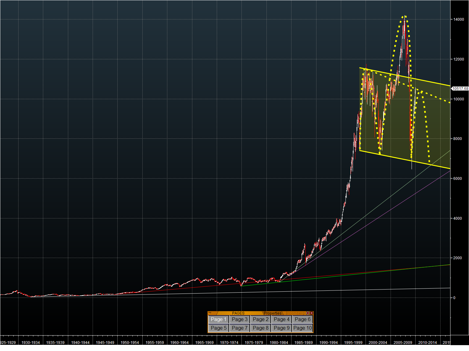
If you believe in H&S TA (and almost every pattern looks like this on the short term – so I am leary of it, again in the short term), here is the “Mother” of all Head and Shoulder patterns on the Dow. EW’ers will immediately recognize the top of an EW pattern.
I like symmetry. The yellow dotted trend line shows the slope implied by the formation of the left shoulder – with all the usual crayon caveats. The solid lines are a channel based on the neckline and certainly gives a plausible target for the right shoulder. That would be between 10900 and 11000 depending on when it gets hit. If the right shoulder is about the same time as the left shoulder, then it will hit the neckline somethimes in 2012 (oooooh, Mayan…… lol).
No company can grow faster than GDP over the long term or else it becomes the GDP. One would expect shorter periods of faster market rises and declines than GDP – just based on human nature. I’m not about to spend a day where large snowflakes are falling gently to earth to compute it – but one can reverse engineer the slopes to derive an implied annual GDP growth. The additional information needed is the average dividend yield for each time period. Go at it.
The above analysis isn’t tradeable in the short term. It simply hypothesises on where the market could wind up in a few years using patterns imposed on the irrational.
THE SHORT HAUL
The market in 2010 will be just like the market in 2009. It will be driven by liquidity and the efforts of desperate old men. There are ample USD available in various programs at least until March. I’m also assuming that there will be extensions, and/or an engineered market drop (by the withdrawal of liqudity temporarily) to ensure that the generational financial rape continues. IMHO, one has to play the odds and probabilities BOTH WAYS to make money here.
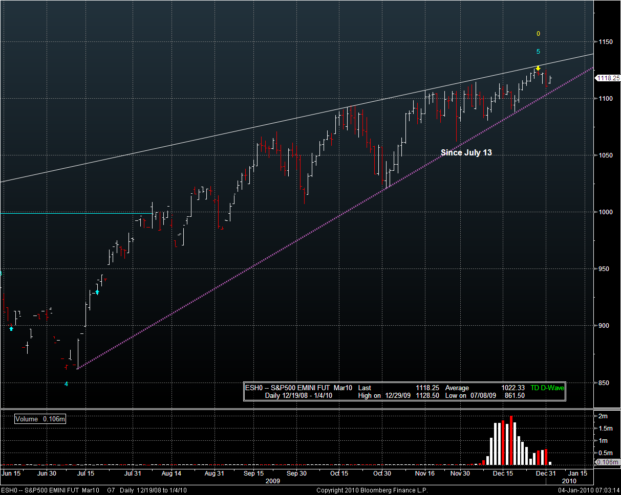
For the last 7 months (at least) the trend for ES has been up. ES is pushing into the nose of a bearish wedge – but the general trend is still up. It is easier to swim with the current, so trades are easier going long on ES.
The SPX chart shows more of the story. Going long here (although it may already be too late given the early pop in ES – ramp and camp again?) at SPX = 1114 would suggest a stop below the confluence of the solid white lines and the dashed yellow line, around SPX = 1111; Going short would probably be best if SPX moved down to those levels – suggesting a trend reversal. If one were to go short here with the implied 7 point pop from ES overnight movement, then a stop above the 50% FIB would be in order (say around 1122). If one is looking for more than a day trade – I would suggest stops at the TD risk level (purple dashed line) at 1134 – but that’s a lot of risk to take on unless one is confident that that will be the top of the market over the next few months.
EQUITY
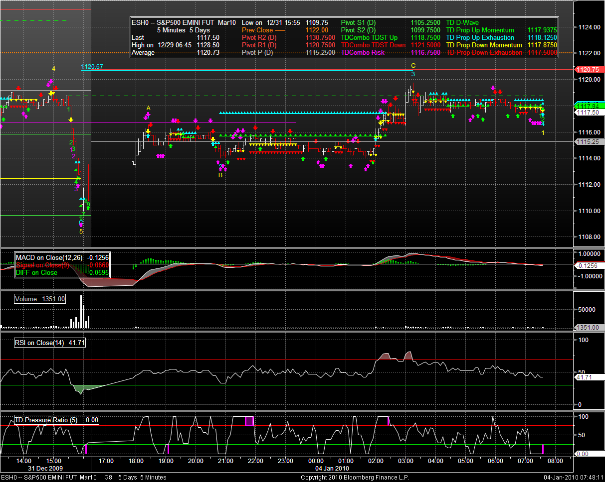
The world is green except for China and parts of the Middle East and Africa. The DAX opened below the pre-holiday highs and is drifting down. ES gapped up at the open yesterday, traded sideways, and then moved up again into the Europe open. ES pivots
- R2: 1130.75 = danger zone that would suggest the upward trend continues
- R1: 1120.75 = comfortably above ES current price and likely to be a roof for any reindeer games. Notice that there is a green dashed line at 118.75 that is TD’s roof. Only a strong move above this will suggest an uptrend for the next while (within today).
- Neutral: 1115.25 = was the ES level until around Europe open. Will likely act as support today.
- S1: 1105.25 = This level suggests picking short entries based on SPX daily chart.
- S2: 1099.75 = to quote Jabbah “ho ho ho ho”:.
FX
The USD is weaker. THe CAD and EUR are on fire. GBP, JPY are slightly stronger. Might be a game of looking for likely yield.
DXY has twoice failed to clear resistance around 78.10ish. Could be the holiday volume – but it has sold off since the Europe open.
NEWS
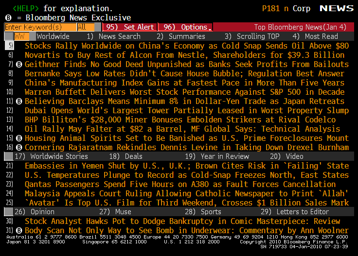
Oil and China are getting the credit for the rally. Funny that China equities are down 0.60%. It might be wise to hold off on any new trades until the dust settles from the New Year games on this first trading day. Wasn’t Avatar unbelievable?
DATA
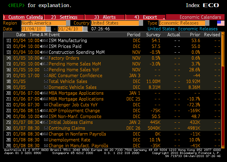
None until 10AM. Doesn’t look like a market mover from here.
Welcome to the New Year. Take a long hard look at the DOW chart above before taking on a tonne of Theta risk in 1st half options.
Cheers.


