Let’s Get This Show On The Road
Let’s Get This Show On The Road
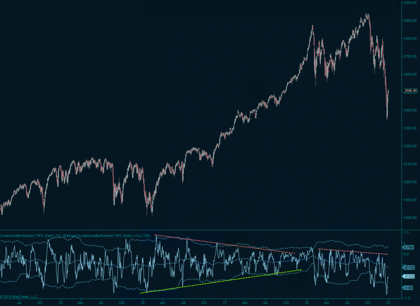
Welcome back everyone. 2018 is finally behind us and our explicit focus going forward is to milk 2019 for all it’s going to be worth. Anywhere I look I see pessimism and doomsday scenarios, people are losing their collective sh..t over things they in reality have little control over. Not on my watch if I can help it. And to prove just that let me share a little goodie I whipped up for us over the holidays:
Say hello to our brand spanking new ‘system quality number’ indicator which I implemented for both Ninja7 and Ninja8. If you don’t know what SQN is then head over to our basic concepts page where you can find the formula and a comprehensive description of its purpose.
Originally defined by Van Tharp SQN was originally designed in the context of tracking system performance. However Van quickly figured out that it also does a very good job of visualizing relative market performance and in particular expressing market cycles.
All that’s needed is to replace the expectancy calculation with the percentage based return of the time window and Bob’s your uncle. Although I came across this approach many years ago I had never bothered to actually implement SQN as an indicator. And boy am I glad that I finally did as I got pretty excited by what I’m seeing.
If you know Van’s work on defining market cycles then you’ll quickly realize that I’m using this indicator somewhat differently. For one Van uses an SQN(100) setting as his primary focus are market cycles. My perspective is somewhat different in that I am using a much shorter SQN(14) seamed by a Bollinger(2.0, 100).
The exact settings however really do not matter and various configurations offer very valuable perspectives. What does matter to me is the fact that a short setting turns SQN into sort of a market oscillator with clearly defined max and min ranges for each instrument. What’s even better is that this phenomenon appears to hold up across all time intervals, going as low as 1-min charts.
The SPX panel shown above offers us a multitude of long term buy/sell opportunities, and if nothing else show us ranges in which profit taking would be optimal. At my current setting it does not express market cycles very well as the window is too small (only 14 days), but both buy and sell exhaustion clearly happens in thresholds that only shift slowly over time.
What I’m seeing right now is a bit outside of the regular swing cycle in that the recent dip lower exceeds all other sell exhaustion signals on the SQN panel. Those are harder to time perfectly (general problem with Bollinger bands during excursions > 2.0 std. deviations) but in conjunction with price based entry systems can still be exploited.
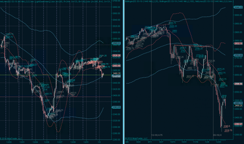
Instead of boring you with theory I prefer to lead by example. Although we are still in a high volatility market phase I looked at the E-Mini this morning and saw a pretty juicy looking buying opportunity which is valid until about ES 2400 – I’ve set my ISL below that.
Otherwise I don’t have too much to offer just yet as we need first need to gauge market sentiment and participation after the opening bell. But no worries, we’re just getting warmed up here at Evil Speculator, a lot more goodies to come this year


