


Linear Regression For Chipmunks
Linear Regression For Chipmunks
I’m working on a coding project today and neither have the time nor the inspiration to talk about the endless gyrations in equities. It’s heads down for me today and most likely I’ll be plugging through the weekend as well. So here’s a much needed refresher course on linear regression which most of you guys probably know as scatter plots/charts. This wills serve as the basis for a future post on how to correlate your prospective alpha factors when developing a trading system. So it’s important to fully understand how this works and why. Enjoy!
Alright now before you run for cover let me assure you that I’ll keep it very light on the math and promise to provide you with plenty of visual aids to make the process less painful. I personally am not a math wiz by any definition.
Plus as your humble host of ten years plus I would know better than to bore you with dry theory that has little application to your daily reality as a trader. Instead what I would like to do here today is to instill a deeper understanding of linear regression and why it is essential to fully grasp the concept in order to actively pursue RED in the context of your system development. Let’s dive right in:
Linear Regression
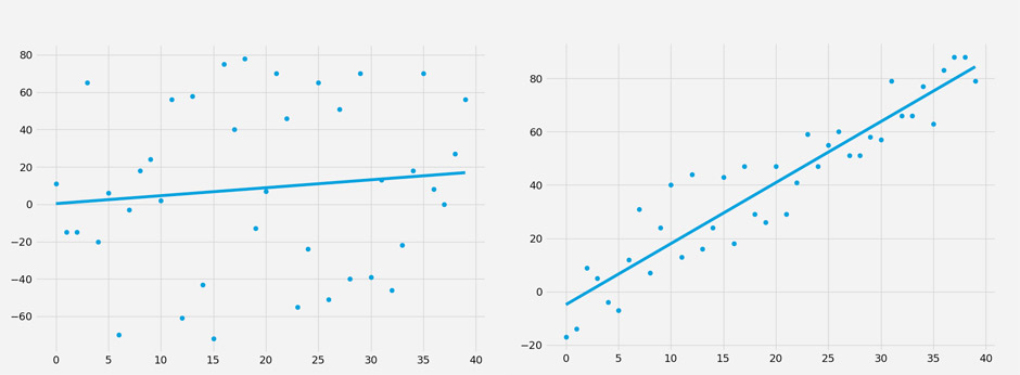
Here we have two scatter plots which I populated with random data, after which I added a best fit line. If I asked you which one is a better fit you would most likely point at the one on the right. But if I asked why you think it is a better fit then you probably would think for a few seconds and then tell me that it’s because the dots are closer to the line. And you would be exactly right.
Just looking at the plot on the left it is pretty safe to assume that there is either very weak or no linear relationship between each respective data point, each of which is produced by two values: x, and y. Thus we have an x axis and a y axis, which are an integral part of our formula:
This simple formula is our basic equation which defines our best fit line. At any point along our (horizontal) x axis we plug each x value into our formula above we need m and b in order to arrive at the y values of our best fit line. So how do we figure those out? Well, m is the slope of the best fit line (also often referred to as beta) and b is the y intercept. But how do we arrive at those?
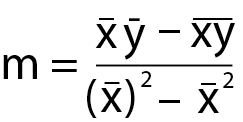
It’s mostly leg work and it looks a lot more intimidating then it really is. We figure out m by:
- Multiplying the mean of all the xs by the mean of all the ys (the x and y with the line above them)
- minus the mean of all the xs multiplied by all the ys.
- Then we take the mean of all our xs and square it
- minus the mean of all the xs squared
- We divide the product of 2 by the product of 4.
Okay we got the slope. All that’s left is to figure out the intercept b, which is even easier:
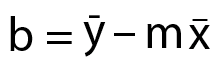
All we do is to take the mean of all the ys and deduct it from the slope m multiplied by the mean of all the xs. And we are DONE! See I promised you it would be pretty painless.
Squared Error
Alright now we are ready to put things a bit more into context:

Here again is the ‘better fit’ scatter plot but this time I have added a few red lines which attempt the visualize the concept of ‘squared error’ or e². Squared error is calculated by measuring the distances between your best fit line and each respective point on your scatter plot.
But just measuring the distance is insufficient because you’ll often have outliers which may skew your dataset plus sometimes the distance may be positive and sometimes negative (i.e. below the best fit line). For that reason we simply square the distance which elegantly solves both problems for us.
You may ask why we do we square it? Why not quadruple it or use an even bigger exponent? Well, you could actually but the accepted norm is a squared value and it seems to work pretty well for most applications. There may however be datasets that would benefit from a higher exponent and you are of course free to use that if you’re a) mathematically inclined and b) are able to write your own linear regression algorithm.
Which is what I actually wound up doing in the context of my own educational endeavors. I felt that it would give me a more deeper understanding of the underlying concept plus I did it in python as an exercise which I enjoyed very much and later helped me move on to more complex topics.
Coefficient Of Determination (r²)
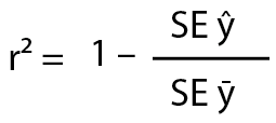
Now it’s time to talk about r-squared. First let me explain to you those strange symbols to you first. SE stands for squared error. The y with the little roof over it stands for the best fit or the regression line on the scatter above. You know – the one we just calculated? 😉

Finally the y with the little line above it stands for ‘the mean of the ys’, which refers to the black line on the plot above (step 4 in our m equation above). And all we’re going to do is to compare the accuracy of that black line with the accuracy of the blue best fit line. Which of course gives us r-squared. See, that wasn’t so hard!
Examples Of R-Squared
Now that you understand the basic concept let’s look at a few example values of r². What we already know is that the range we’re going to be dealing with is 0 to 1. If r² = 0.8 then the product of the division must be 0.2, right? Which in turn would mean for example that the SE of the best fit would be 2, and the SE of the mean of the ys would be 10.
Given that example the squared error of the (blue) best fit line is significantly better than that of the (black) mean line. And that’s a good thing of course and it means that our data is pretty linear. If the r² is 0.3 on the other hand then the product of the division in the formula above must be 0.7, which in turn may be produced by 7 / 10. So now the SE of the best fit line is only marginally better than the SE, and yes all other things being equal that is a bad thing. Of course the accuracy of your model always depends on the type of data you are analyzing.
Done!
And there you go, NOW you understand the basic concept of linear regression and the mythological r² value you probably have been hearing about every once in a while. In a future post we’ll dive in a little deeper in order to understand how we can actually leverage our newly gained knowledge.


