Mixed Bag Market Momentum
Mixed Bag Market Momentum
Gauging market momentum is as much art as a science in that you’ll probably always find charts that satisfy a particular directional bias. The trick lies in remaining as objective as humanly possible and to collect evidence from a diversity of sources. As many traders are starting to return from their summer vacations I thought it a good idea to get everyone a jump start on what’s going on.
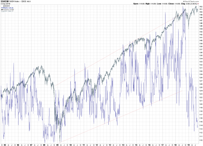
And a great way to lead the conversion is with a long term view of the SKEW index which quite frankly blew my mind as I hadn’t looked at it for quite a while.
What is the SKEW and why should you care? Here’s the definition I lifted off Investopedia:
“The SKEW index is a measure of potential risk in financial markets. Much like the VIX index, the SKEW index can be a proxy for investor sentiment and volatility. The Skew Index measures perceived tail-risk in the S&P 500.”
Now I’ll be the first to note that the SKEW, albeit well intended, is a horrible index and has almost zero predictive quality. However – that said and looking at the big picture here – isn’t there something that sort of pops out at you?
I am referring in particular to the fact that thew SKEW was gyrating higher inside a pretty well defined channel during a ten year timeframe spanning between 2009 and 2018. Then it suddenly dropped like a rock last summer and has since worked its way lower.
In fact the SKEW is currently around 114 which it hasn’t touches since the aftermath of the 2008/2009 financial crisis. Let that digest in your mind for a second – despite all the bearish chatter you’ll find in the MSM the S&P 500 is trading a mere 100 handles below its all time highs.
At the same time SKEW is pinned at historic lows, which stands in stark contrast with what we are seeing on the implied volatility front. What gives?
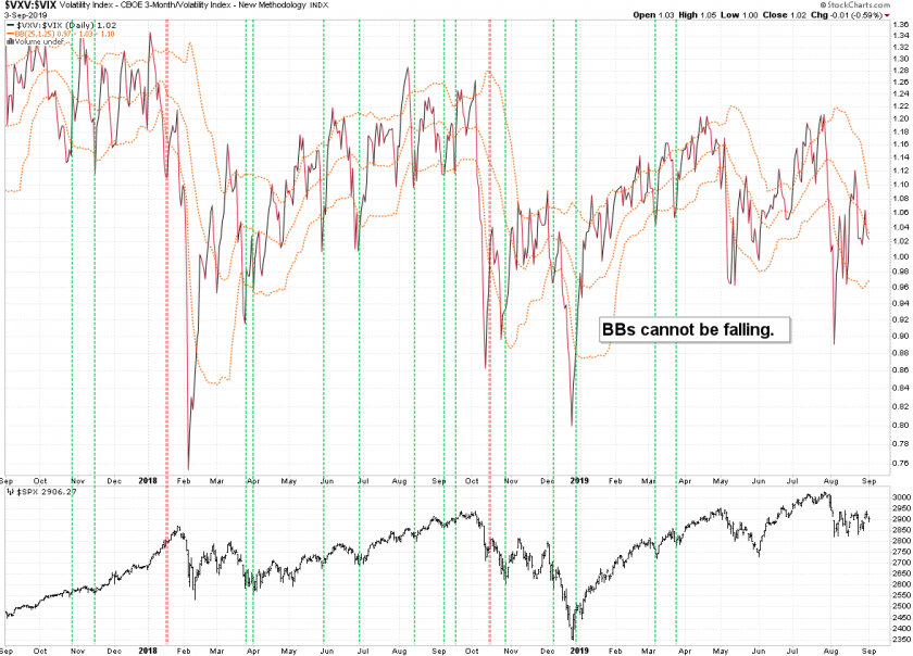
Case in point – here’s the Implied Volatility Term Structure (IVTS) which is back in bearish territory and continues to rise. That is usually a medium bearish sign, especially if the BBs are rising.
Here’s the inverted chart which I to pin possible buying opportunities. Falling BBs here make it more difficult for quick sell offs to turn into a BTFD opportunity. What you want to see is a recovery from below the BB while it is rising, which according to this chart has a high probability of success.
Much more below the fold for my intrepid subs:

It's not too late - learn how to consistently trade without worrying about the news, the clickbait, the daily drama and misinformation. If you are interested in becoming a subscriber then don't waste time and sign up here. The Zero indicator service also offers access to all Gold posts, so you actually get double the bang for your buck.
Please login or subscribe here to see the remainder of this post.


