Momentum Analysis: Bonds And Equities
Momentum Analysis: Bonds And Equities
A fascinated topic in which I have been taking a deep interest over the past few years has been the dissection and tracking of market momentum in various market sectors. To that end I am primarily interested in answering the following four questions:
- In what market phase is the issue/index currently active? Short/Medium/Long Term?
- How is the issue/index performing relative to recent history? Negative/Positive performance?
- What is the state of realized volatility (RV) and how does it correlate with implied volatility (IV)?
- Given the above which trading style/system is applicable?
So nothing really ground breaking here, at least from a conceptual perspective. But in the real world, where our trading capital is on the line on a daily basis, how do we extract this information and better yet: make the data work in our favor?
After all we are not interested in writing academic dissertations here. Money talks – bullshit walks, right? I’m sure you didn’t come here to look at charts for entertainment, otherwise I strongly advice you to find some kind of hobby. What you (hopefully) seek is actionable information that enables you to be a more productive and effective trader.
Well, at least that has been and will remain to be the fundamental premise of this digital den of dastardly market domination.
Picking Our Poison
The confidence interval of my average trading window is somewhere between 2 to 10 days. Which means I am less interested in what the weekly and monthly charts for pure trading purposes, but I’m obviously need to consider it as part of the overall long term market phase.
Because it would be foolish to engage in range/MR trading in medium term trending markets, and the inverse. Similarly I probably will be less interested in BTFD setups if we are clearly in the midst of a raging bear market.
Alright, Mole – now tell me something I don’t already know!
Alright! Having tried a number of measures in order to peg the three boxes mentioned above, I have over time (and via iterative trial & error) boiled it all down to two relatively simple indicators on a 60-min chart. That covers the lifespan of the majority of my campaigns after all.
- Bollinger(SQN)
- Bollinger(Range)
Now these are my personal favorites per my personal lens. Yours may differ significantly but it doesn’t really matter as it’s merely a matter of preference.
The top indicator measures the relative state of the market’s performance (via a slightly modified SQN formula) – and the bottom one uses a smoothed signal of simple candle ranges (highs – lows). Both are seamed by Bollinger bands because both market performance and realized volatility are relative measures.
By relative measures I mean that signal strength or weakness needs to be interpreted in the context of recent historical context. An example would be the VIX dropping from 18 to 10 within one week in comparison to it dropping from 12 to 10 in one week.
Or the S&P falling 50 handles in a bull market vs. a fall of 50 handles during an ongoing bear market. How do you look at these two events in the context of the overall situation? So yes, context always matters, especially when it comes to fashion or making sense of financial charts.
And what applies on a macro level does, to some extent, also apply on the more short term end. Which is where most of our trading happens, unless you are a long term investor.
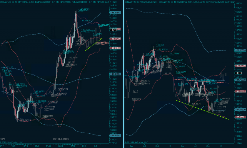
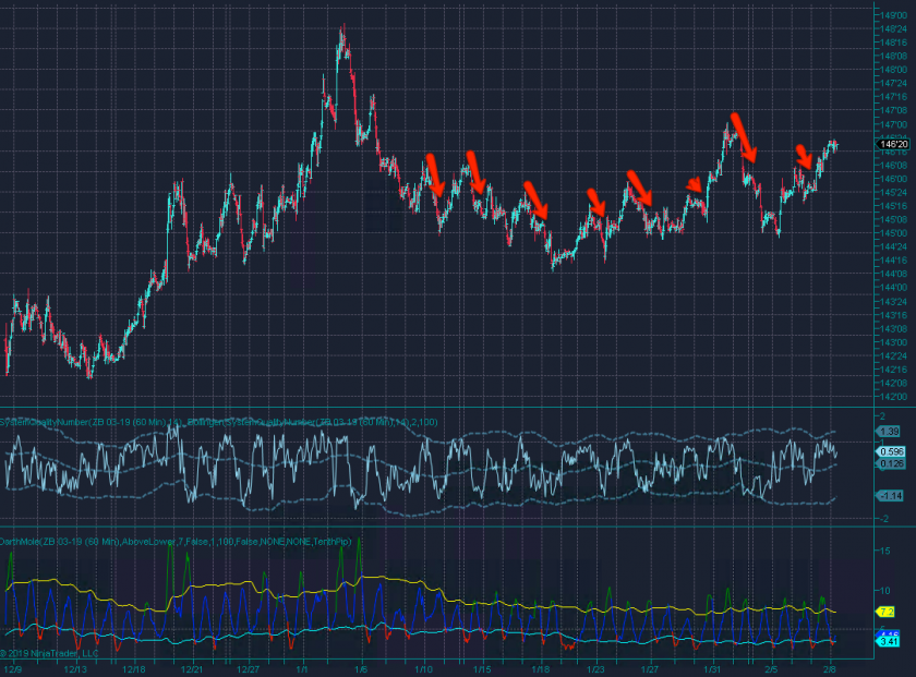
The ZB futures chart above is a pretty good example. On the macro level we are potentially at the cusp of a break out market (just based on price behavior) and I’m among many who are considering some long exposure.
The main question for me is this: Should I go long or do I wait for another dip lower?
So let’s look at our three check boxes:
- The market phase right now is: MT: Early break out phase. ST: Sideways.
- Relative performance: MT: Consolidating after first break out attempt. ST: near the highs and now falling according to SQN.
- State of RV is sideways after a significant signal reduction.
- Applicable trading style: break out system trading which can be migrated into a trend trading system.
What I’m also noticing, and that’s where simple labels/measures often fail, is that small corrections usually seem to happen after SQN highs with RV turning higher. That’s kind of what we should expect but be warned that it’s not always working out that way.
You sometimes see RV jumps during explosive bear market snap backs, and even during bull market phases. But for now my take away is that – yes, I want to be long here but I probably can wait until I see SQN near the lows and RV expected to turn lower.
Are we having fun yet? I didn’t think so but this is important stuff, so I recommend you embrace the pain and internalize this stuff as it’s going to help you a lot in your daily activities.
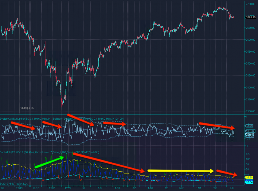
Shown above is the E-Mini – again on a 60-min panel.
- The market phase right now is: MT: Unclear – either early bull market or bearish corrective. ST: Trending higher but now drooping lower.
- Relative performance: MT: Consolidating after reaching medium term resistance. ST: Falling according to SQN and attempting to paint a floor.
- Once again the state of RV is sideways after a significant signal reduction.
- Applicable trading style/system: trend continuation system a.k.a. BTFD systems (only problem is that IV is still a bit elevated)
What stands out otherwise? Right away to me that the Bollinger on the SQN has normalized after a wild expansion during the recent sell off. Again, makes sense as only fast markets expand SQN like that and fast markets usually (but not always) happen to the downside.
What seems to precede minor corrections are periods in which the SQN signal kind of meanders lower without touching the upper or the lower BB lines. As a matter of fact it started to do this during the recent highs and it just recently managed to touch the lower BB.
It has not managed to conquer the SMA in the center however (recent reversal) and another leg lower may be in the cards.
My take away here is that I don’t want to be short (yet) in what appears to be a pretty bullish market on a medium term basis. I may be wrong but I can live with that as I probably would get a decent enough entry opportunity later down the line.
Remember – calling tops is a losing and foolish endeavor. So is calling bottoms by the way.
I do want to be long but right now seems premature, so I decide to stay away and wait for either a convincing spike low or some other ST pattern that justifies taking a long entry.
Okay, enough with dry theory – for we have setups! Meet me in the lair!

It's not too late - learn how to consistently trade without worrying about the news, the clickbait, the daily drama and misinformation. If you are interested in becoming a subscriber then don't waste time and sign up here. The Zero indicator service also offers access to all Gold posts, so you actually get double the bang for your buck.
Please login or subscribe here to see the remainder of this post.
Bonus Chart:
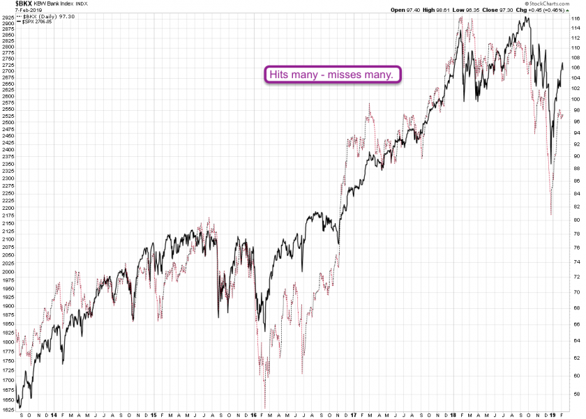
So Julie posted a BKX:SPX ratio chart yesterday and since I’m a sucker for exotic ratio charts I decided to take a closer look. Usually I start by just plotting the two on top of each other, which is what you’re looking at above.
And here’s my assessment: It indeed nails many highs in equities via bullish divergences but it also seems to miss equally many. Of course when it comes to the BKX you want to give it more weight ahead or during unfolding bear markets:
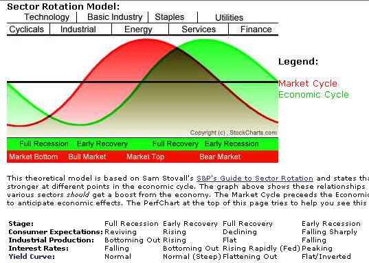
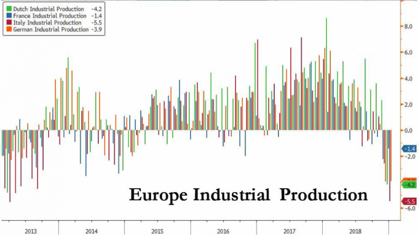
As you can see market cycles always lead the economic cycle. So assuming that we are near the top in the economic cycle it’s possible that the U.S. is going to follow Europe’s lead:
But frankly color me skeptical on that end. Hate or love Trump but thus far the economy seems to be humming along quite nicely, to the chagrin of his political opponents.
Again, I don’t care much about politics, I care a lot more about where the economy is heading on a medium term basis. At the current time the BKX may indeed be a good sell but as a correlation chart I see conflicting data.
Of course please feel free to prove me wrong: as I said, I’m a sucker for cool ratio charts
Enjoy your weekends.


