Evil Science Theater 4000
Evil Science Theater 4000
We have a small cause for celebration today as this will officially be post #4000 here on Evil Speculator. Which incidentally was launched all the way back in early August of 2008 – almost exactly nine years ago. It was a time of wonder back then and electricity had just been invented a few months earlier. I still remember having to take an Uber horse buggy to the evil lair in the morning, on muddy unpaved roads seamed with beggars and packs of rabid wild dogs. Trading was done by telegraph in encrypted morse code and our favorite way of shorting commodity futures was by arson of a hapless local grain farmer. Those were the days! Quite a few of you regulars from back when are still here to this very day, and all I can say is this: Boy have we learned a lot, and how the heck did we even manage to survive all that drama?
By doing what we do best – beg, borrow, steal, and never ever trade against the Fed. Well, I promised to make this a special post which probably means it’ll suck completely, but let me give this my best shot. Plus as this is a special occasion I’ll make it all available for free – so you leeches can rejoice. You may however consider getting off the fence and signing up for either Gold or the Zero so that we’ll be able to celebrate 10 glorious years 12 months from now.
As you know volatility – both realized and implied, has been one of my obsessions over the past few years. Something you keep hearing over and over again is how the VIX is mean reverting and if you look at a regular chart then it’s easy to swallow that pill.
Well, allow me to disagree, and unlike many I’ll back up my claims with actual data. First up let’s define what we mean by ‘mean reverting’ – basically we are testing for stationarity and we’ll be doing this via the Augmented Dickey Fuller (ADF) test. This tests the null hypothesis that demand follows a unit root process. You usually reject the null when the p-value is less than or equal to a specified significance level, often 0.05 (5%), or 0.01 (1%) and even 0.1 (10%). Now what’s important to note is that a) you define your test threshold ahead of time (in most cases it’s 5%) and that b) that the p-value is interpreted as a binary value. Either it is < 0.5 (high confidence of mean reversion) or it is not (no confidence of mean reversion). And that means a p-value of 0.51 would still mean we do not accept the null hypothesis.
Anyway, enough of the math babble, let’s run this sucker, I’m going to test 10 years of the VIX as well as 10 years of the VXV, then I’m going to test a ratio of the two. Let’s start with a threshold of 0.1:
p-value = 0.0324767618187 – The series VIX is likely non-stationary.
p-value = 0.103166277707 – The series VXV is likely non-stationary.
p-value = 6.34799786578e-06 – The series VIX/VXV is likely stationary.
p-value = 3.37882429904e-29 – The series VIX/VXV % Change is likely stationary.
And there you have it, given 10 years of daily VIX data, it turns out that according to the ADF, both the VIX and the VXV are not stationary and most likely only median reverting and otherwise following a subtle random walk. However it turns out that the raw VIX/VXV as well as its % change series has a 95% chance of being stationary. Now let’s run the same test with a 0.5% threshold, which to my understanding is considered acceptable for a financial series:
p-value = 0.0321613338723 – The series VIX is likely stationary.
p-value = 0.103166277707 – The series VXV is likely non-stationary.
p-value = 5.73166440286e-06 – The series VIX/VXV is likely stationary.
p-value = 3.2970819598e-29 – The series VIX/VXV % Change is likely stationary.
The VXV is still non-stationary apparently but the VIX apparently does satisfy the zero hypothesis with a confidence level of 95%. What does all that mean for us?

It means that mean reversion strategies should not just focus on the VIX on its own but its relationship to the VXV as, according to the ADF, it is considered stationary at a 99% confidence level. Above I produced a plot of the VIX:VXV ratio as it gyrates around its actual mean, which is around 0.91 over the past 10 years. We could obviously use a smaller or wider window but I think the mean wouldn’t shift by much. I also added thresholds at plus and minus one standard deviation. As you can see there are quite a few long and short VIX entry opportunities (or long SPX or the SPY) with several long entry opportunities as well. The latter however would be a lot more difficult over the past year and we probably would have to push out another standard deviation.
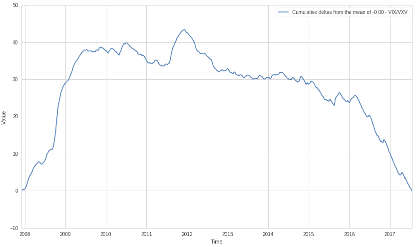
Here we are looking at the cumulative of the same ratio’s delta from the mean. Basically deduct the mean from the actual value and then add up the result. Due to the current mean we are starting and ending at the zero mark, but this basically shows us the net aggregate of investor sentiment over the past decade. Draw your own conclusions – I know I will
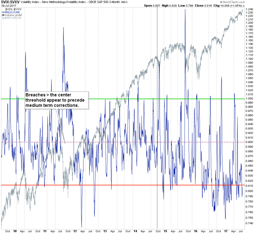
The thresholds I am using on my old manual chart are mostly done by observation but seem to match the calculated standard deviations pretty well. One of my epiphanies on this chart was that breaches above the mean (which again I nailed almost perfectly – hum hum) seem to be the ones which precede medium term corrections. As you can see we are still light years away from any of that.
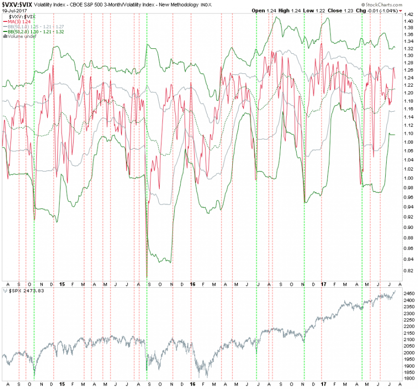
This view of the VIX:VXV ratio shows us reversal periods via two stacked Bollinger bands I slapped on it. You basically look for a signal push > the lower 2.0 BB for a long entry and a signal drop < the upper 1.0 for a short entry. Unfortunately stockcharts doesn’t allow me to hide the superfluous lines. Anyway, apparently the long entries are pure gold and the short entries are so-so – not surprising as we’re in a raging bull market. I expect this situation to reverse one day when equities embark on a long needed corrective phase.
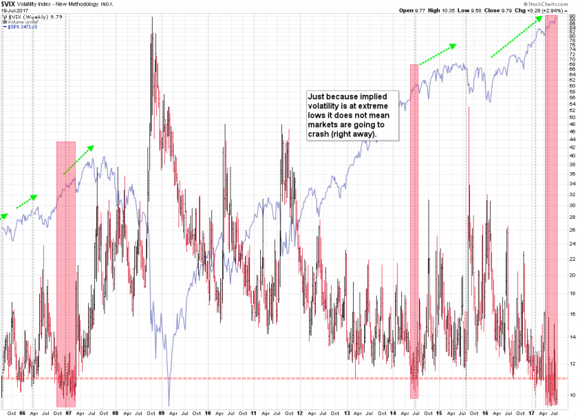
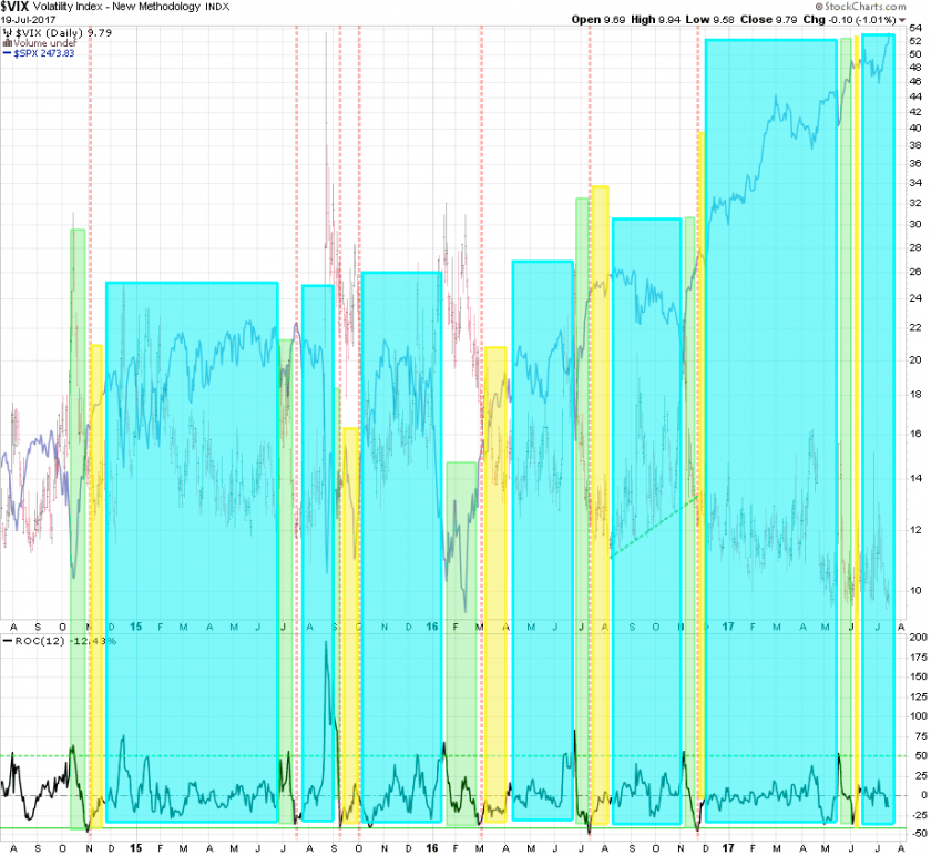
Now here’s the VIX again all on its own on a regular chart plotted on top of the SPX for context. The red ranges show us when it was scraping the bottom of the barrel and when buying yourself some long term protection against six sigma events was available at a discount. If you’re holding equities right now then this is a good time to grab a handful of long term puts and simply forget about them – cost of doing business and tantamount to bringing an oxygen mask when climbing Mount Everest.
The VIX ‘Easy Rides’ chart shows us in a cyan period and that means pretty much anything can happen on a short term basis, but medium or long term don’t even try to short this bull market.
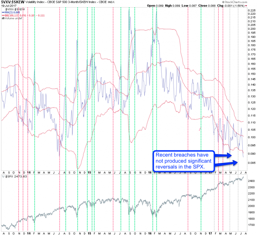
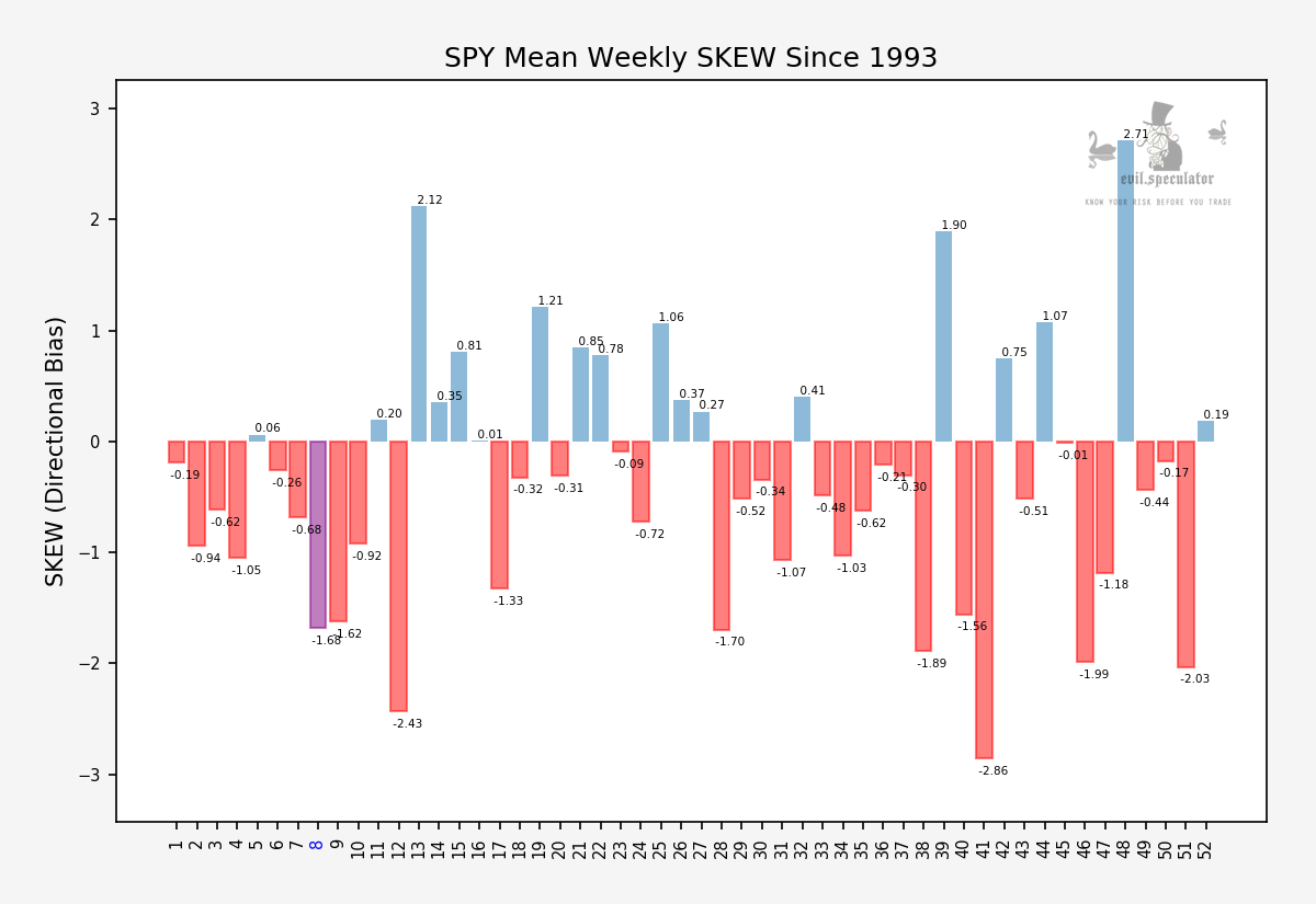
The notorious CBOE SKEW ratio is pretty useless on its own but the SKEW vs. the VXV has been manna from heaven when it comes to calling long reversals. Short reversals again – not so great and if they happen they usually come weeks later, so timing entries requires other measures and I usually just look at price near important inflection points. As you can see recent breaches of the lower BB have not led to meaningful corrections in equities. We’re most likely going to get another one soon but that doesn’t mean the market is about to turn on a dime.
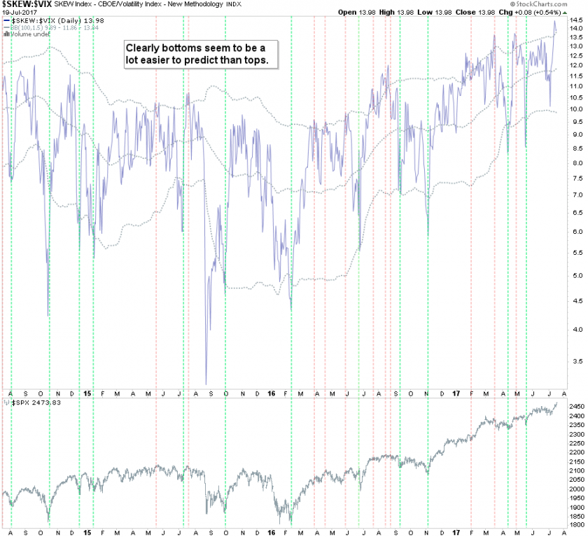
Of course I also had to chart the SKEW vs. VIX and once again the smart money bets on market bottoms.
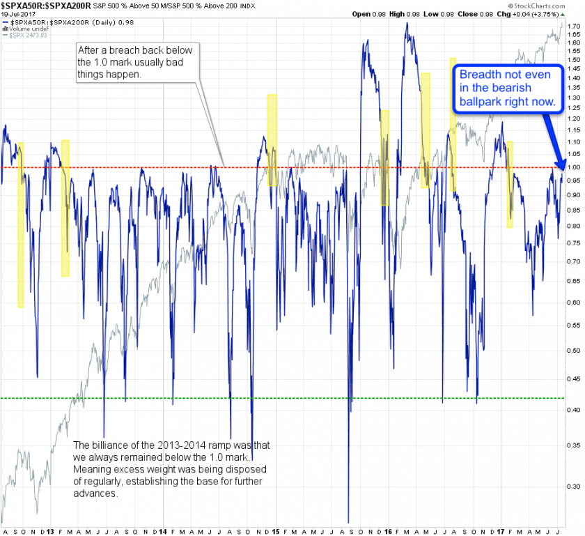
Finally we’ll be wrapping things up with market breadth courtesy of the SPX50 vs. the SPX200 (the R is the % change version). And once again we are nowhere near bearish territory and if you any plans to short this market then I humbly suggest you keep your powder dry for now and wait for further instructions.
Public Service Announcement
It’s summer and this post took me quite a while to put together while everyone I know here in Spain is out and about enjoying a beautiful summer.

My poor wife is probably online right now browsing for divorce attorneys so I’ll better be taking Friday off and do my best to talk her out of it. All services will run as usual tomorrow – see you all bright eyed and bushy tailed Monday morning!


